Collaboration GUI
A prototype of an online collaboration tool UI
Date:
November 2020 - January 2021
Keywords:
UI design, Graphic design, Wireframe
Tools:
Pen and paper, Figma
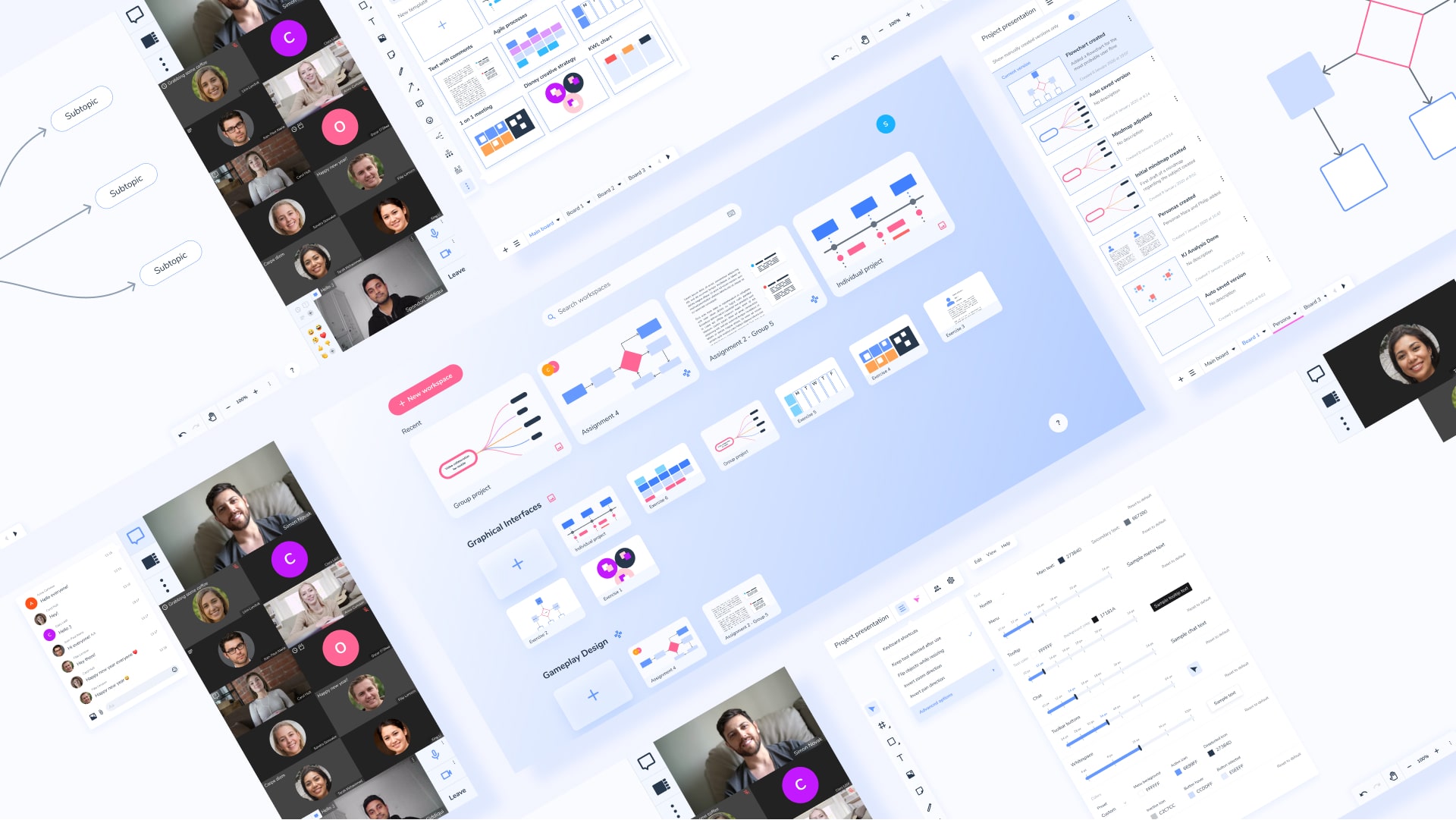
A Figma prototype of an interface for an online collaboration tool. The project involved applying UI design knowledge in practice into an interactive prototype.
The challenge
This project began about half a year after the beginning of the pandemic. After several months of remote work, some programs were beginning to be regarded as the standard, such as Miro or Figma for brainstorming and design, and of course Zoom or Microsoft Teams for video meetings. However, there were not really any known tools that worked for both. Thus, the focus of the project was to design an interface which enabled users to collaborate on ideas and projects remotely while also incorporating functions for video calls.
The process
User research
The intended user group for this interface was rather broad - it was people who worked on collaborative projects remotely. Usually, I would gather data about the users’ goals, needs and preferences through some form of user research. However, the goal of the project was not to go through a traditional UX process, because the project was about UI design and there simply was not enough time. Thus, despite the fact that one would not usually do this, we were encouraged to think of ourselves as the user group, seeing as we ourselves had had half a year’s experience of collaborating on projects remotely. In the interest of time, this was the one time that it would be okay for us to base our design decisions upon our own thoughts and opinions of the interface.
Thus, the requirements were as follows:
Requirements
The interface should have:
- Video feed with useful data such as participant name, and icons for different status (muted mic, host, co-host, etc). Video of course includes audio.
- Basic controls such as mute mic, mute camera, select camera, etc.
- Common, collaborative canvas area for co-creation and manipulation of things such as
- Text
- Mindmap
- Post-it
- Simple graphics such as flowcharts
- Imported graphics
- Some representation of who has created what content, and who is editing what content
- A way to create, select, and move between different break-out groups
Nice to have:
- Status icons such as BRB, AFK, etc.
Sketching
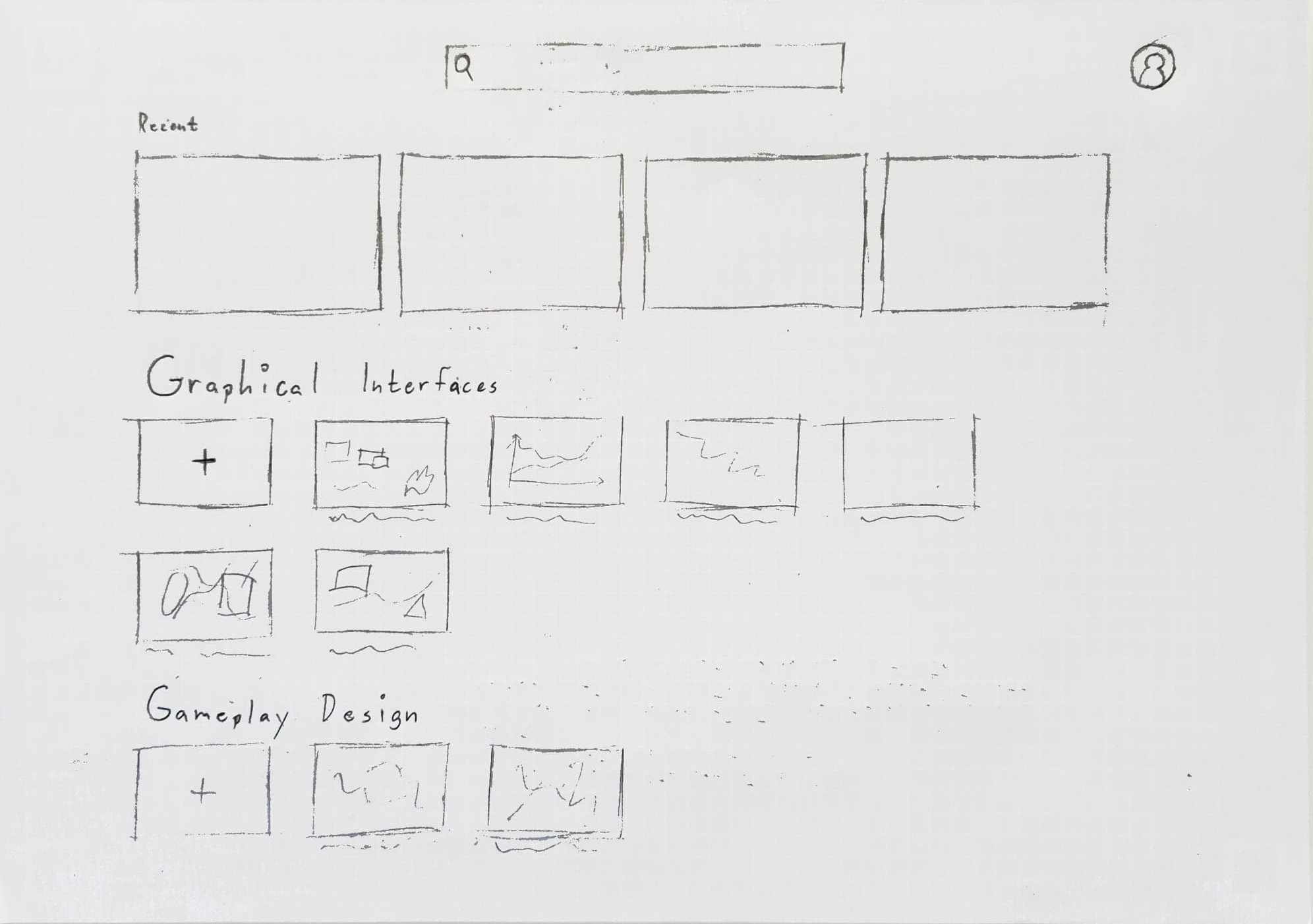
The process began with sketching on a layout of the interface on paper. The first sketch shows a suggestion for a layout of the entry point to the home page. Because the interface was intended for people in a team, I thought it would make sense to let the users organize their projects into groups.
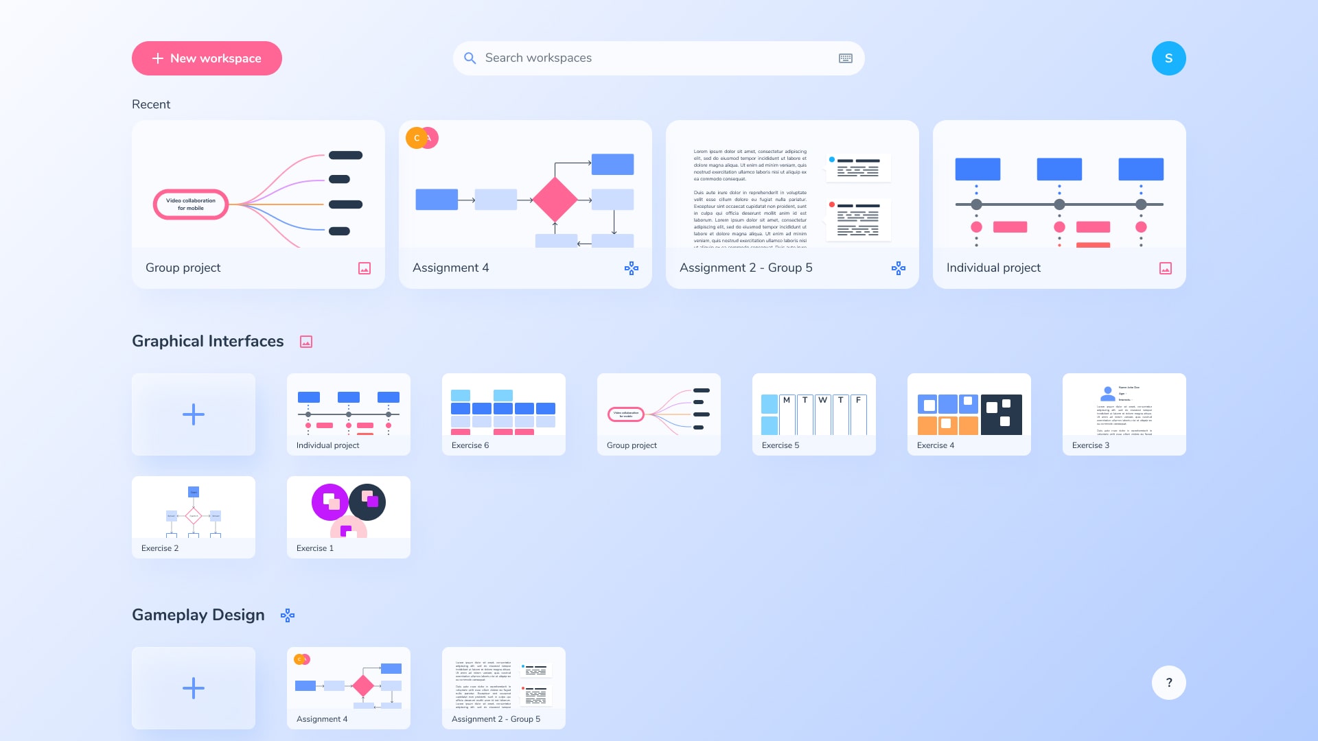
This is why the interface is laid out so the user can create workspaces (which are basically shared folders), and then create projects within those workspaces. The home screen also includes a searchbar and the most recent projects for quicker access.
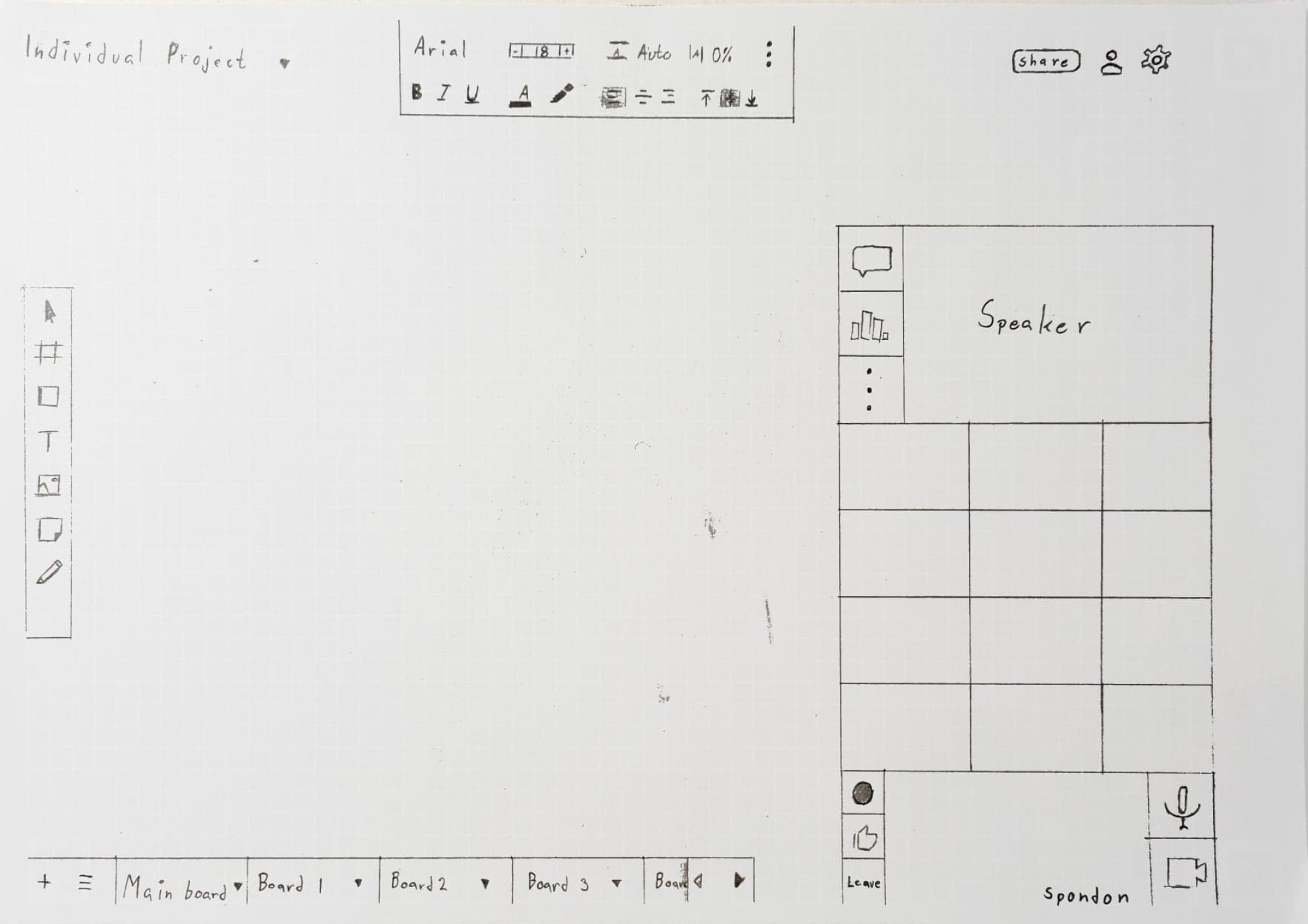
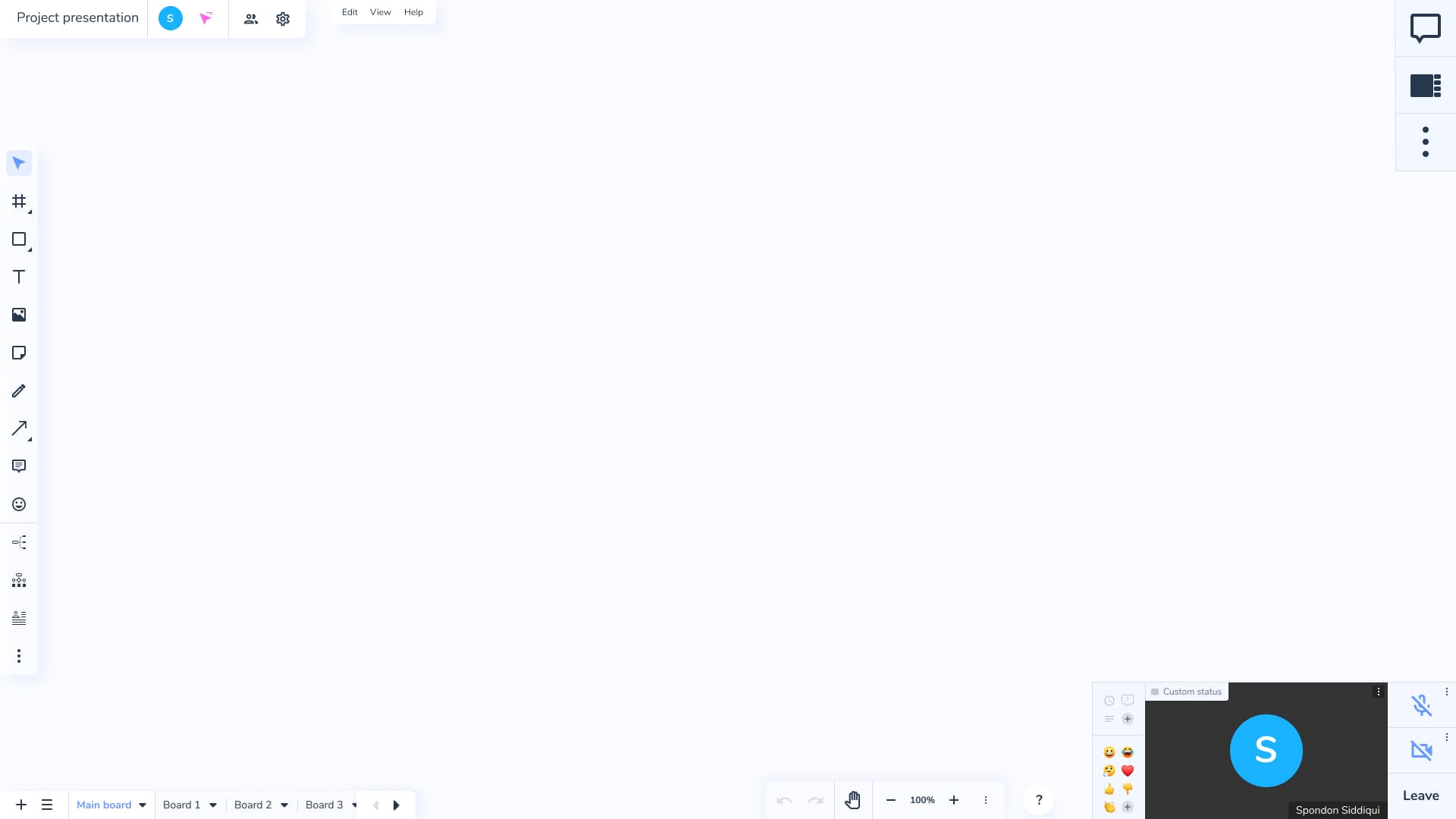
I tried laying out the elements of the UI in such a way that users would feel familiar with the UI. This is why the title of the project is in the top left corner, the tools are to the left, etc. The main canvas area that the user will be working on is in the middle and takes up most of the UI because that is where their focus will be most of the time.
The meeting controls and video feeds are on the right side of the UI, laid out in a grid. Your own video feed is at the bottom and the person that is currently speaking is at the top, along with buttons to show the chat or create a poll.
Creating a Figma prototype
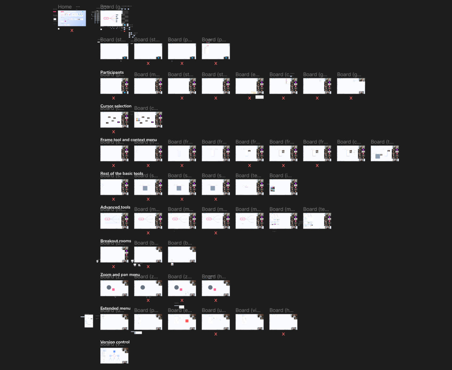
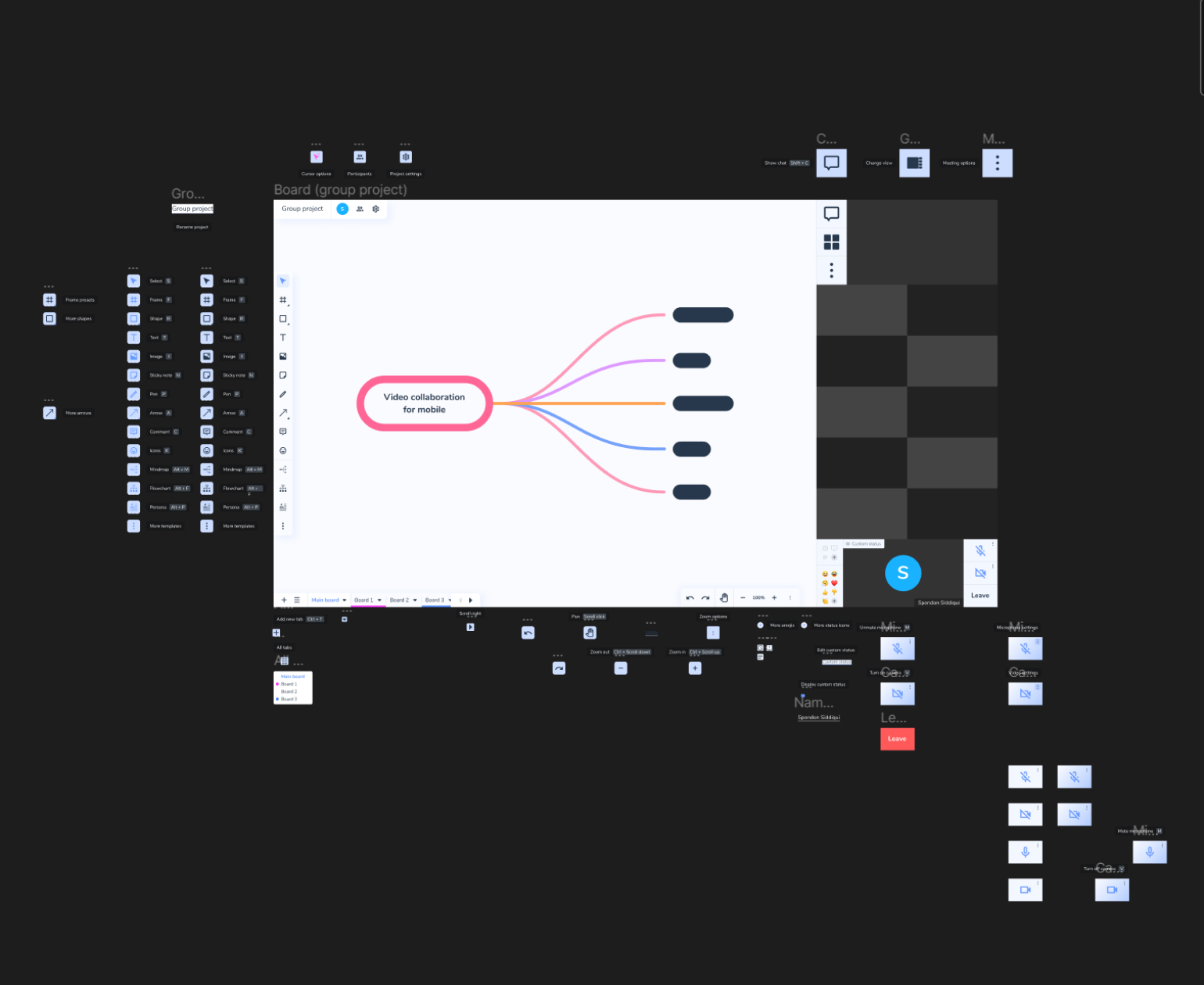
With the sketches as a base, I created a prototype of the UI in Figma. I grouped the frames together based on what functionality they showcased and ordered them in the order of steps a user would typically take when using that part of the UI.
The prototype is interactive, and includes hover states, overlays and animations.
The result
The final prototype consisted of 52 frames in total, though some of them were similar and mostly showed different states of the same thing. Screenshots of the different parts of the UI can be seen below.
Home
On the home screen the user gets an overview of all their projects and their workspaces. To help with this, the interface allows for assigning icons to workspaces so that the user can more easily distinguish between them.
Main view
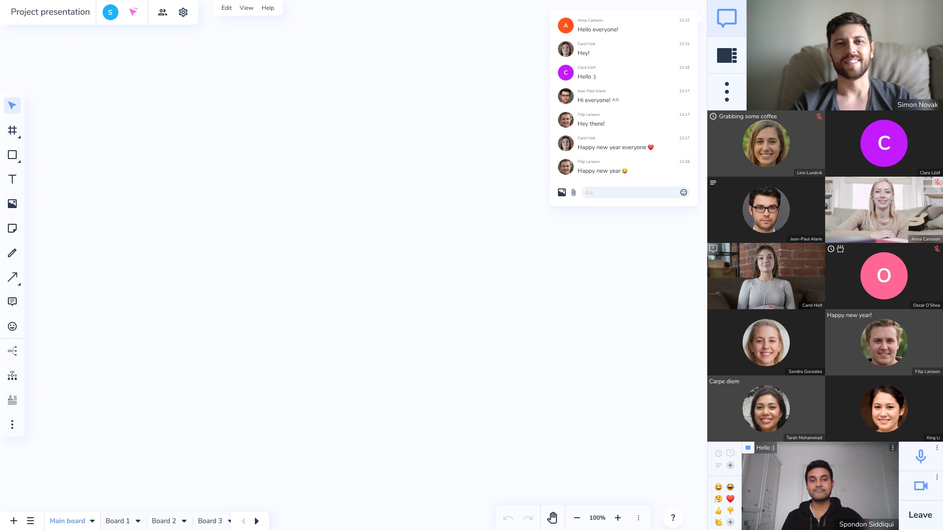
The main view consists of a main canvas area in the middle, because that is what they will be focused on most of the time. The various groups of buttons are placed around the edges.
Video feeds and chat
The video feeds are shown to the right of UI, with the speaker at the top and the user’s video at the bottom. Buttons and controls related to the user, such as mute or status icons, are thus placed near their own video. Buttons and controls related to the meeting, such as the chat or general settings, are placed near the top.
Cursors and mini videos
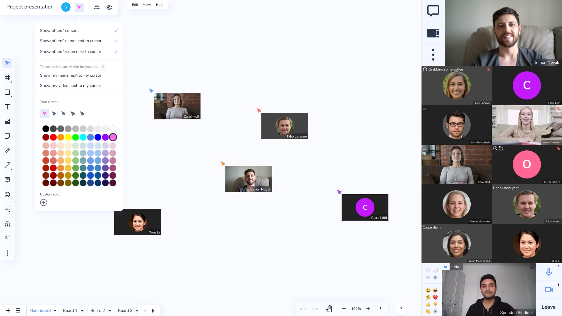
In order to make use of the spatiality, I decided to let people’s videos and their names follow their cursor. However, this could quickly become annoying if you have many people moving their cursors a lot, so I included options to remove this visual.
Context menus
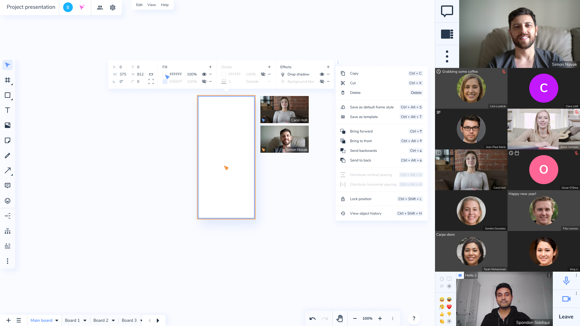
When you click on an object, that object's contextual menu is displayed, not just for you but for everyone. This makes it easier to see what people are currently editing. If this contextual menu had been fixed to a side of the screen, like in Figma, you wouldn't be able to see when people are tinkering in the menu. The contents of this menu changes depending on what you have selected. There are also options that shouldn't change depending on what you have selected, like copy or delete. I've put these under the more options button that is displayed next to every context menu. Moreover, when someone clicks on an object, their video stops following their cursor and is instead placed next to the object. This is because otherwise the video would cover up the object.
Images
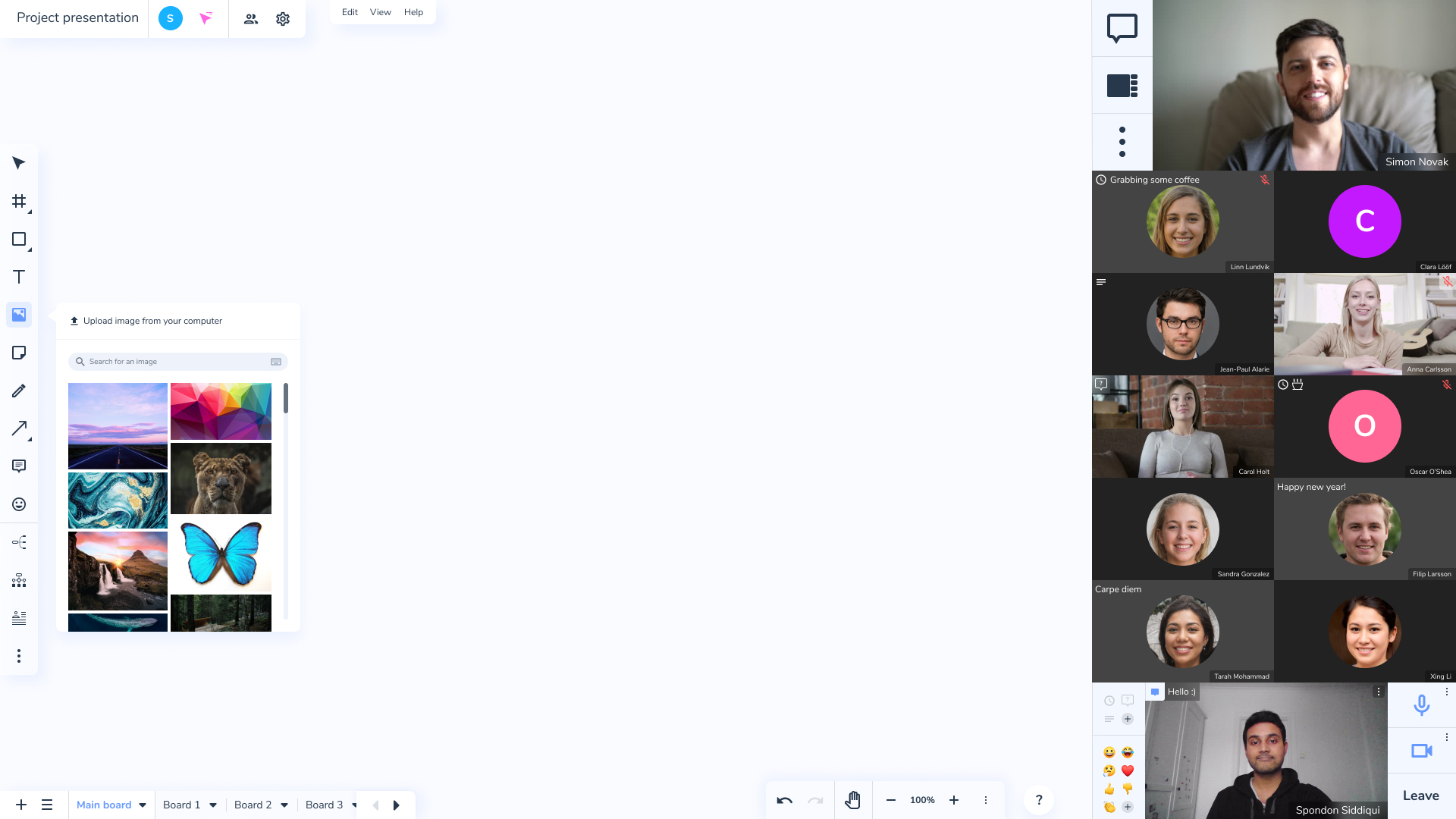
In many programs (that I have used at least), adding images can be kind of cumbersome. I usually have to go to google images, search for an image, copy it and then paste it, or in some programs I might even have to save an image on my computer and then upload it. So, I decided to implement some form of way to search for images in the interface itself.
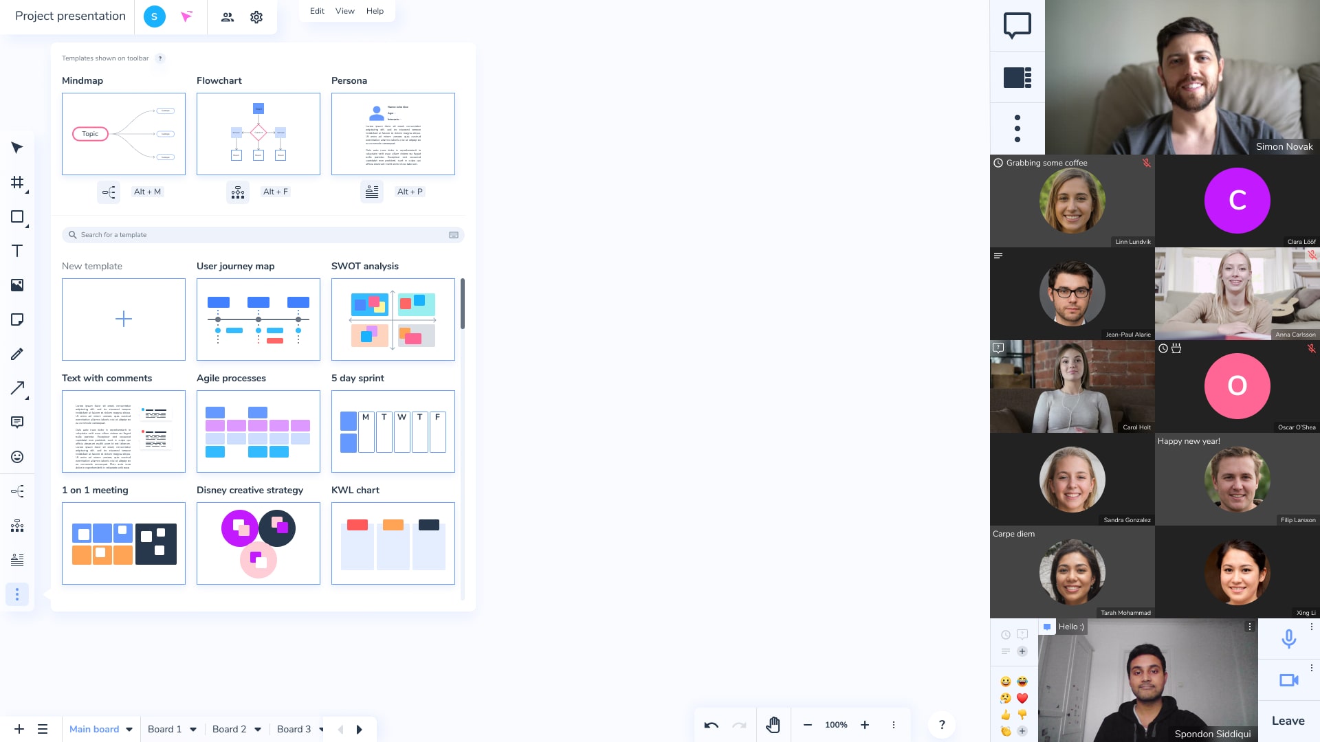
Templates
As mentioned before, the bottom of the toolbar contains buttons for adding templates, like a mindmap or a flowchart. This was implemented in order to help improve the workflow of intermediate users, you can just add a mindmap with a single button instead of having to manually add a bunch of rectangles, text and arrows. You can also add or customize templates and you can change what templates show up on the toolbar.
User preferences and accessibility options
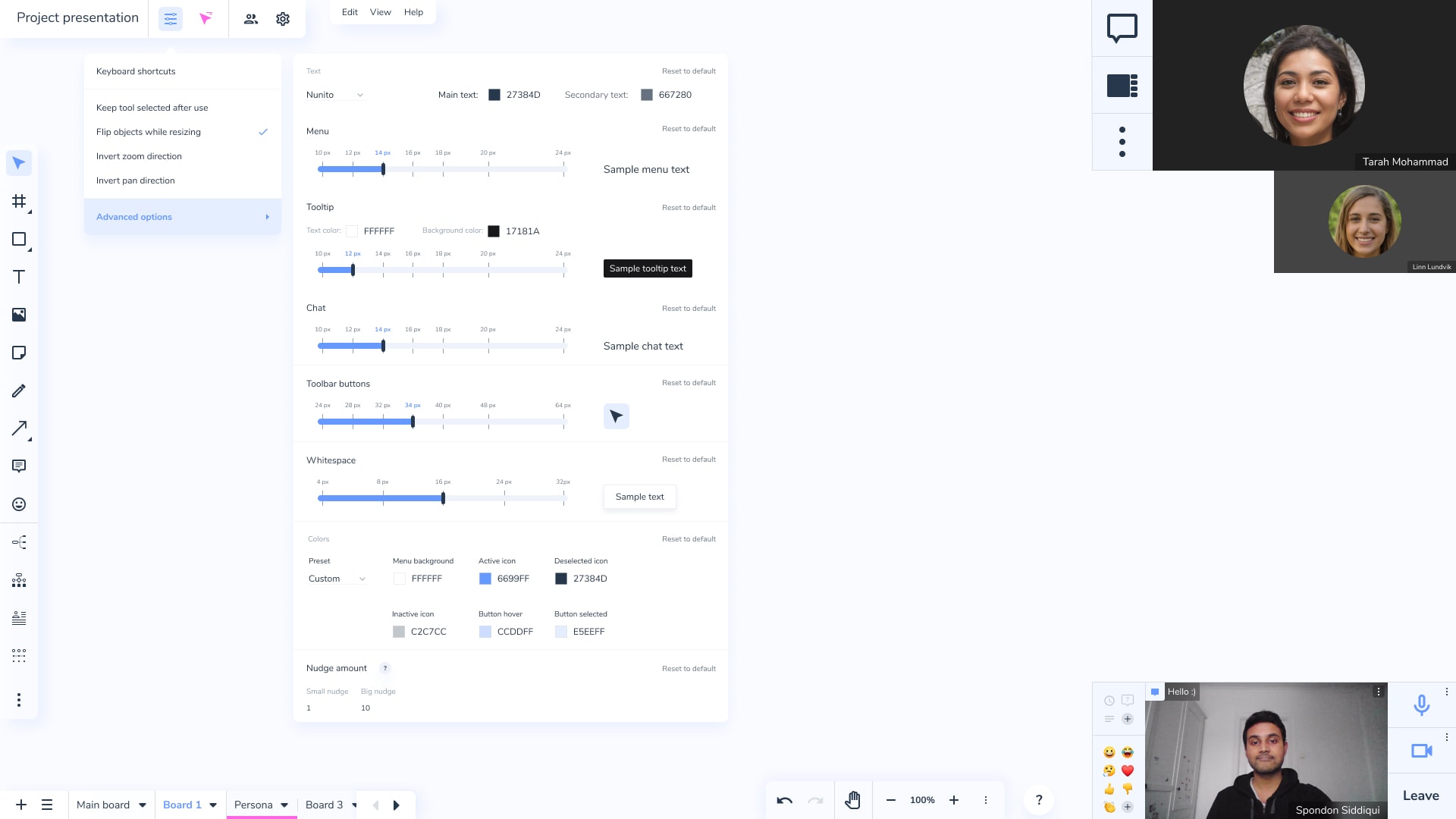
There is a user preferences menu because not everyone has the same needs or preferences. In the advanced options there are even more accessibility options, like for changing the font sizes of different elements or the colors. This was a no brainer, there should pretty much always be accessibility options. However, we don’t want people to change things so much that the interface breaks, so I used sliders in order to provide bounded controls. I decided to provide visual previews so the user can see their changes immediately.
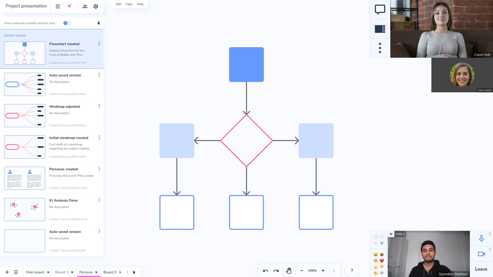
Version history
Here is the version history, which includes previews and time and date. The program also automatically creates versions for you. You don’t need to ever interact with these versions if you don’t want to, but it could be nice to have just in case.
