BAT
A web application to analyze a company's environmental impact based on their bookkeeping.
Date:
June 2022 - October 2022
Keywords:
UX design, UI design, mockups, user research, usability testing, web app
Tools:
Pen and paper, Figma, Miro
A web application made for GoClimate. The project revolved around replacing GoClimate’s existing tools and workflows with a web application that would make one of their workflows more efficient, intuitive and user-friendly.
The challenge
GoClimate is a social company with the purpose of making it easier to start living a climate-neutral life, to slow down the climate change. They offer a service that calculates companies' emissions based on their yearly bookkeeping, resulting in a climate report showing a company's emissions and their corresponding emission sources. To produce this report, GoClimate had to go through a very inefficient and unenjoyable process. GoClimate needed a software tool to make this process less laborious and to reduce the time it took from receiving a request from a company to producing a climate report.
The process

User research
The project began with some initial user research. I held interviews with users and stakeholders to look into what pain points there were with GoClimate’s current workflow. The two main problems found were inefficiency and unintuitiveness.
“There are many steps that feel unnecessary. It takes too long to go through invoices and just feels very inefficient.”
“It is difficult to understand the workflow. It feels confusing and I rarely know whether or not I’ve done things correctly.”
Ideation and sketches
With the pain points mentioned above and with the goal of trying coming up with a solution that would help solve said problems, we began ideating on the interface for a web application called the Bookkeeping Admin Tool, or BAT for short.
We found that there were four main parts that the interface needed to have:
- Information about the company whose invoices you are working with
- A list of the company's invoices
- An image of the invoice you are currently working with
- Some way to add how much has been spent on different emission sources
With the parts of the tool being decided upon, I brainstormed and sketched on a few different layouts which included these four parts...
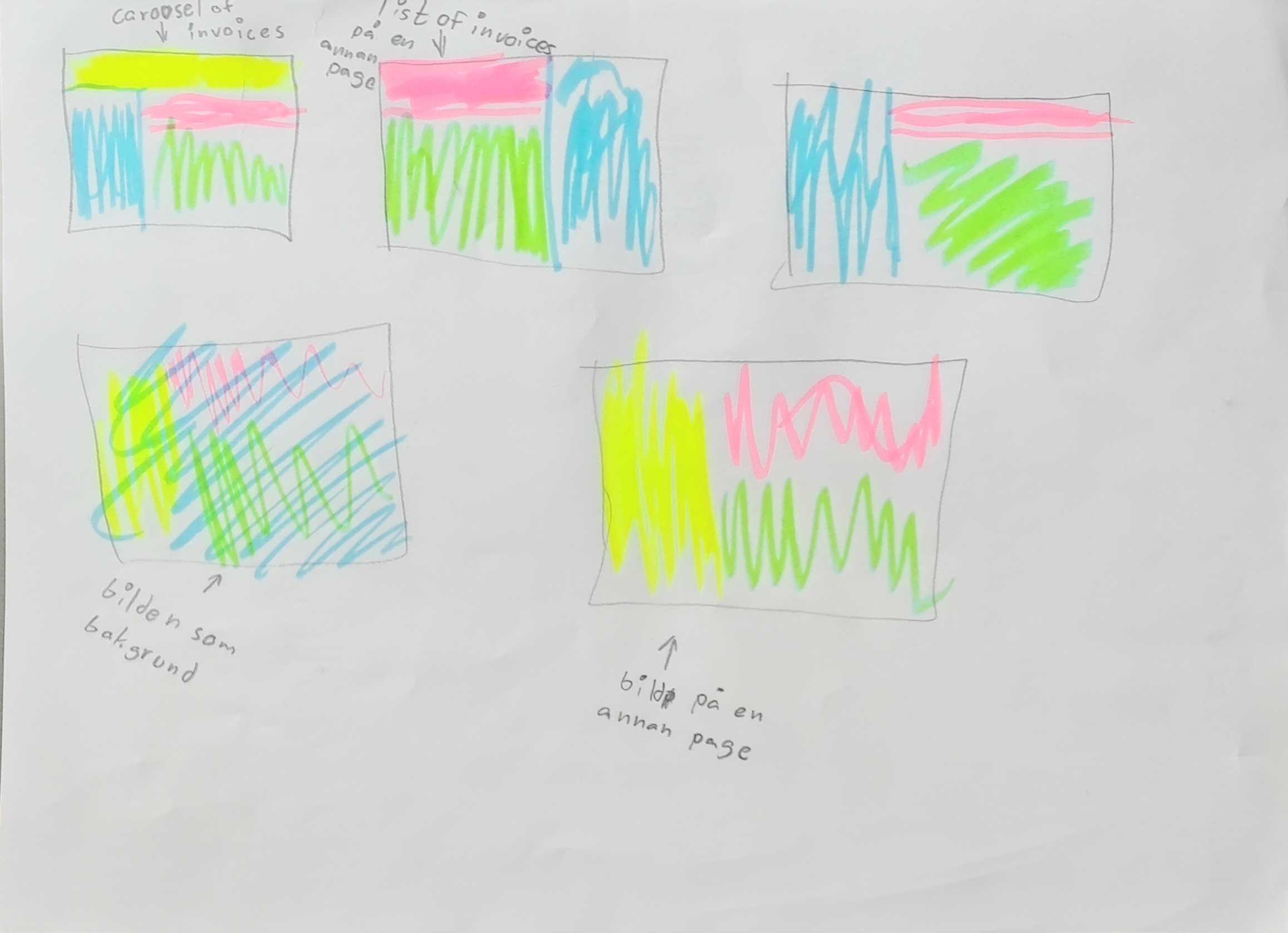
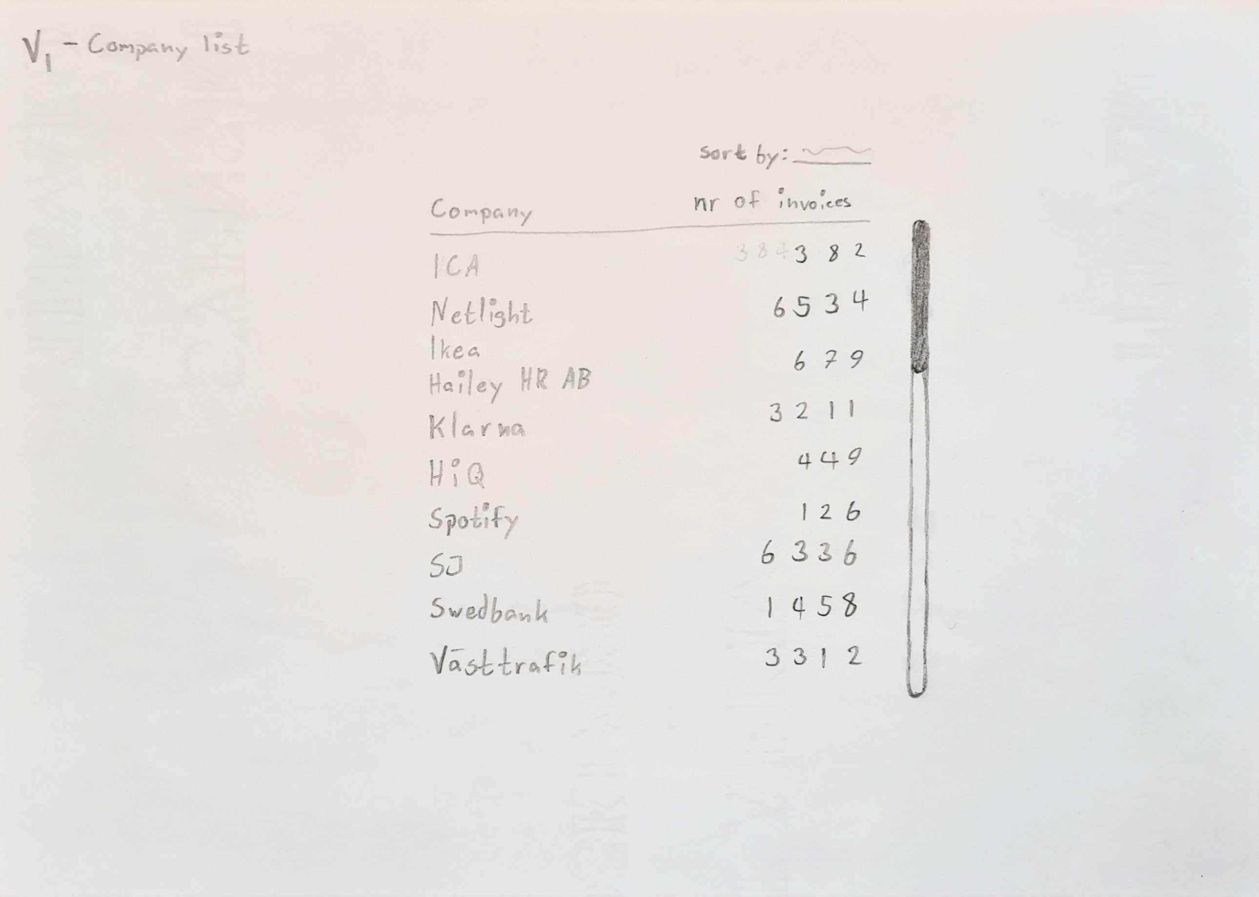
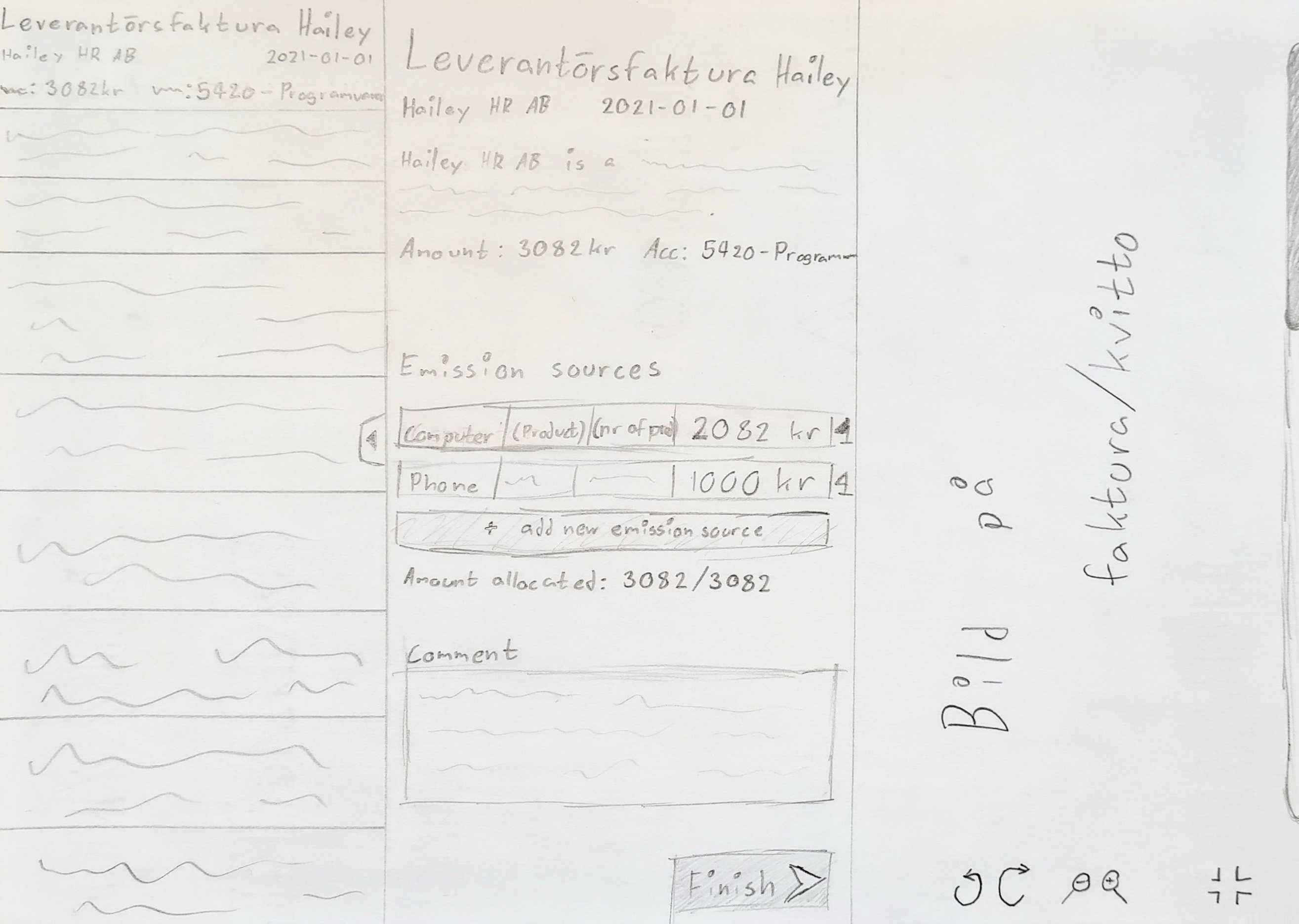
...and created the following sketches in the end. The first picture shows an overview of all companies that GoClimate has received invoices from. From here, the user can click on a company and go to the main view.
The solution sketch for the main view shows some information about the company you are working with to the top left, a list of the company’s invoices to the left, an image of the invoice you are working with to the right, and a sort of main work area in the middle.
Quick feedback on sketches
With these sketches in hand, I held interviews with stakeholders and users to evaluate the layout. People seemed to like the overall layout of the interface and there were things that felt very helpful for making the workflow as easy and efficient as possible, such as the invoices displaying information such as supplier or just the fact that the image was always visible and had image controls. There were however some details that felt as if they would be slow or confusing to use. Digging deeper into the answers showed that the users were talking about the middle part and especially the form of input for the emission sources. In other words, users wanted an easier way to tell the program how much has been spent on different emission sources. This was the most important thing to get right, as it would be the action that users perform most often when going through invoices, so I went back to ideate some more on this.
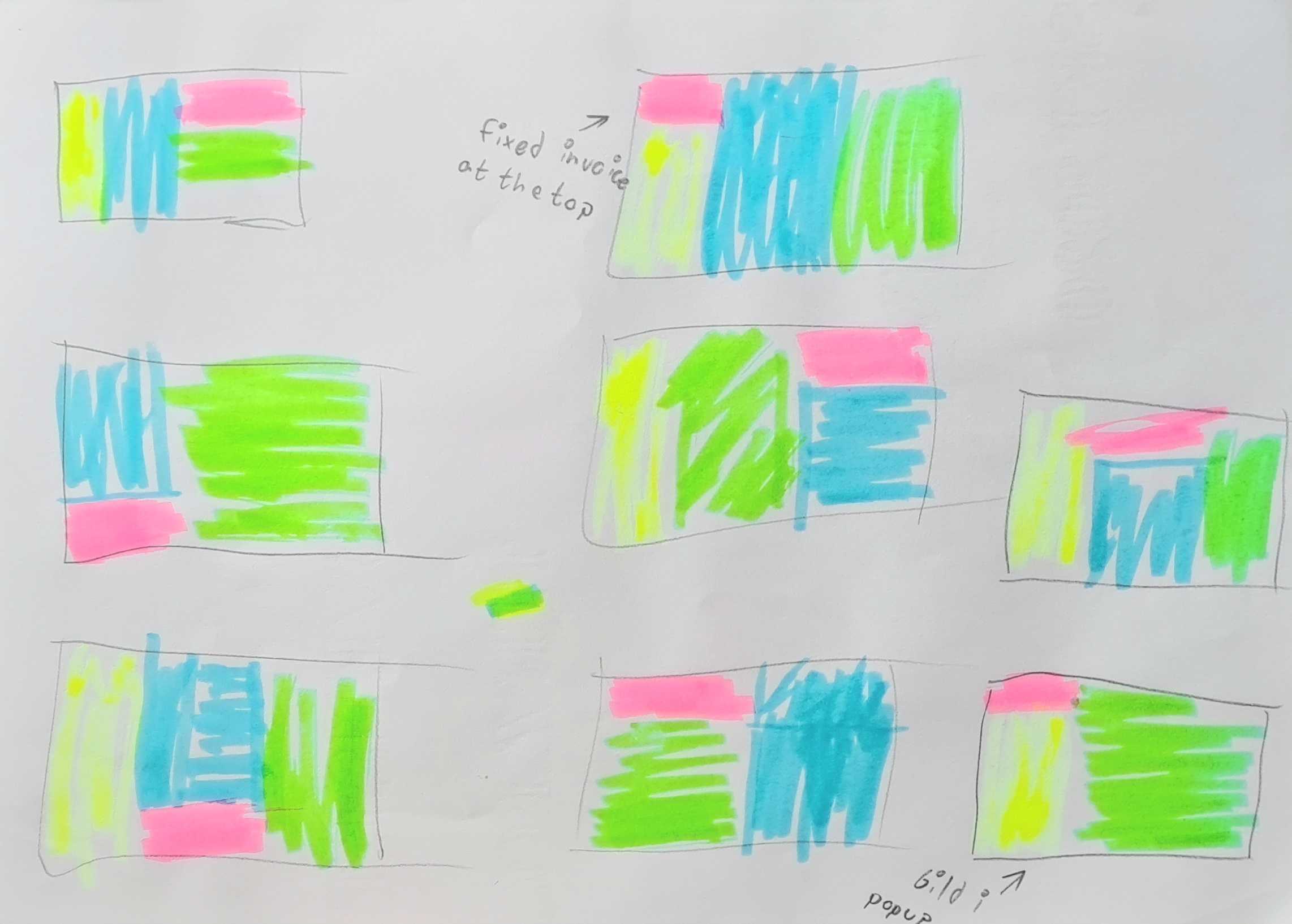
Sketching on way of input for emission sources
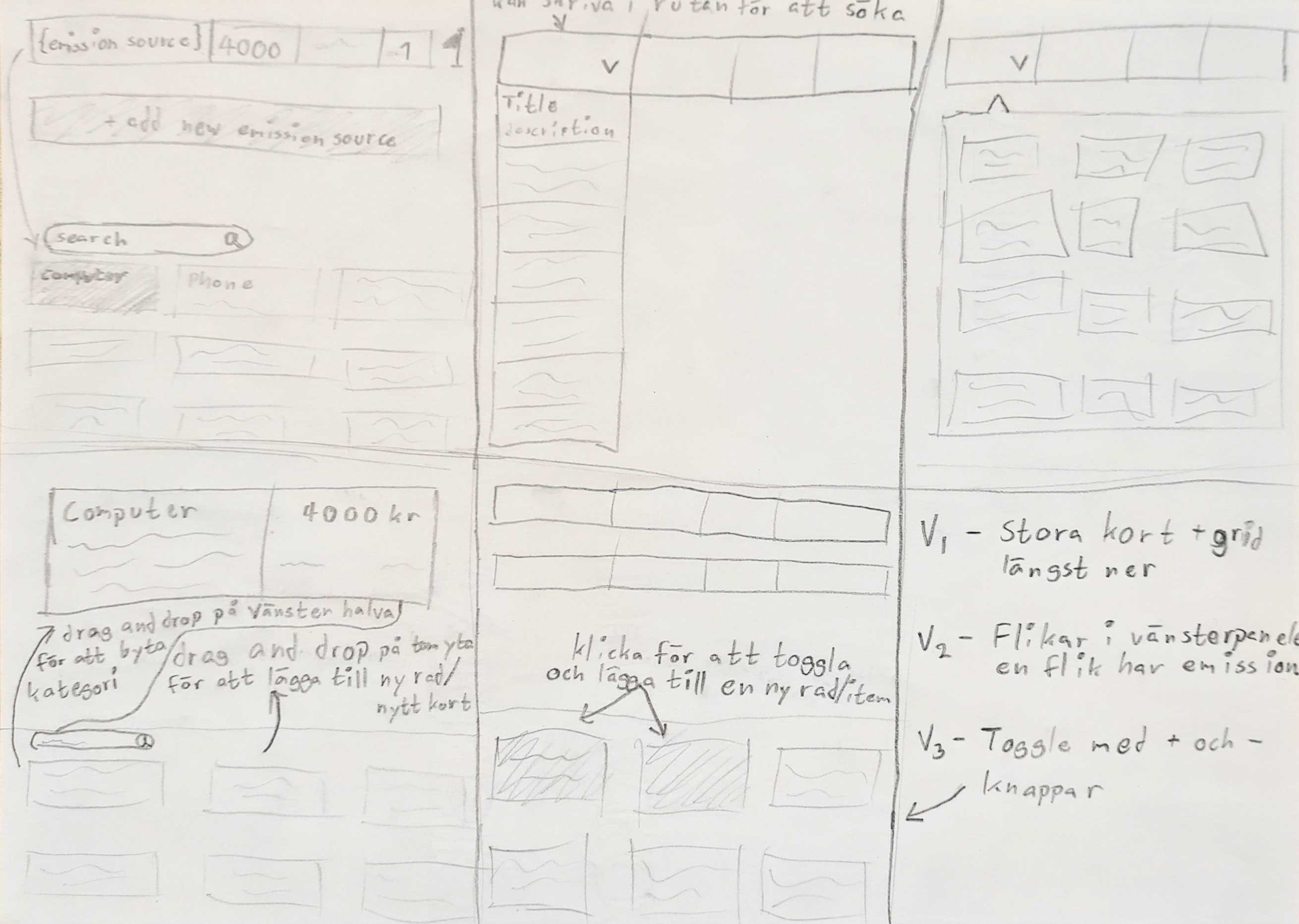
After some more sketching I had a couple of potential ways of adding emission sources which can be seen in the sketch above. This included drop downs, grids, toggled cards, and cards of different sizes. Some of these ideas seemed to retain the problems previously mentioned in the feedback from the users, but some seemed promising. To evaluate what I had and to gather some more feedback, I moved on to create wireframes and mockups for the ideas that seemed most promising, with the intention of using these mockups when conducting user tests.
Wireframes, mockups and prototypes
The next step was now creating variations of the different components that would be needed. Before I could begin with this though, I had to decide on fonts, colors, icons, etc. and essentially create parts of a design system. This would be needed going forward as well, so I began creating the beginnings of it and created the component variations necessary for the user prototypes that would be used in the user tests.
Note: The picture to the right shows the finished design system at the end of the project. Before the user tests I created only as much as was necessary.

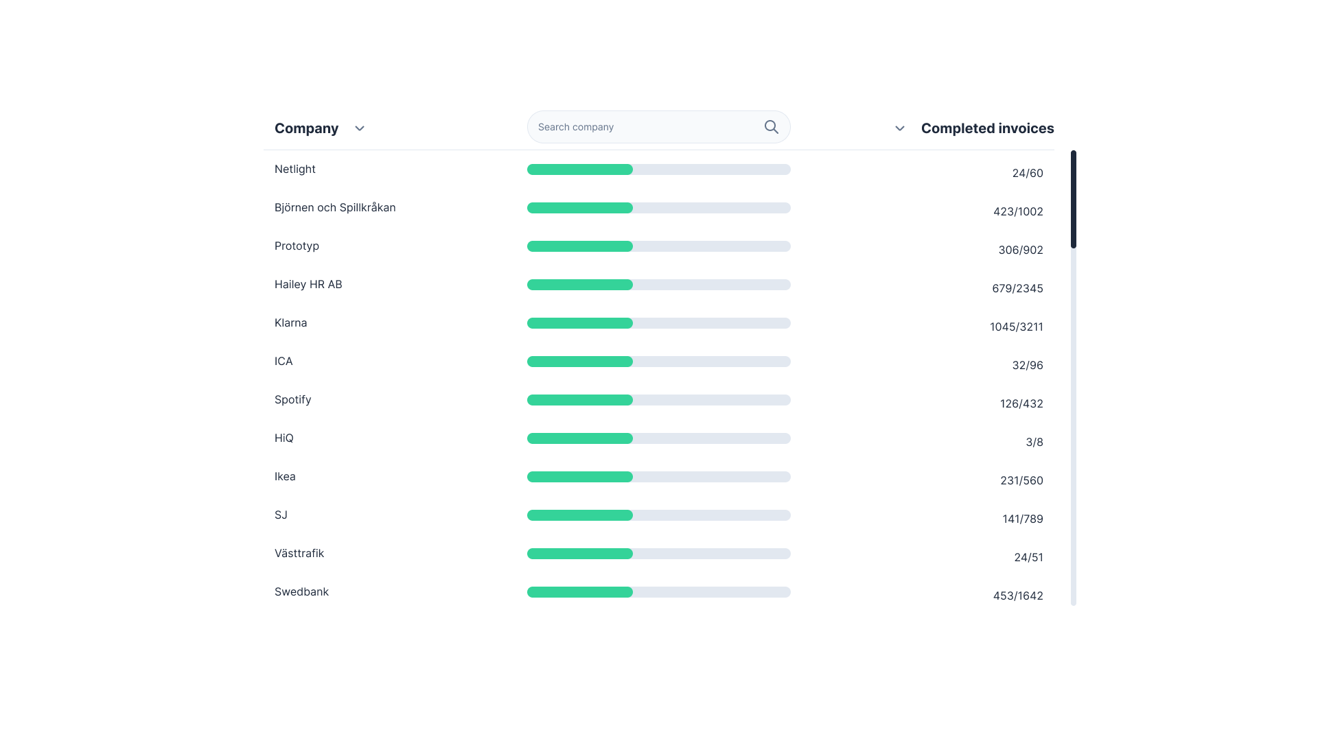
Now, having parts of a design system to base the design upon, I created higher-fidelity mockups of the ideas from the sketches. The picture to the left shows the home view, which just has a list of companies. The pictures below show two of the variations of the main view, along with some variations for emission source cards and ways of adding emission sources. These mockups were then used for some user tests to learn what users felt about different parts of the different versions of the interface.
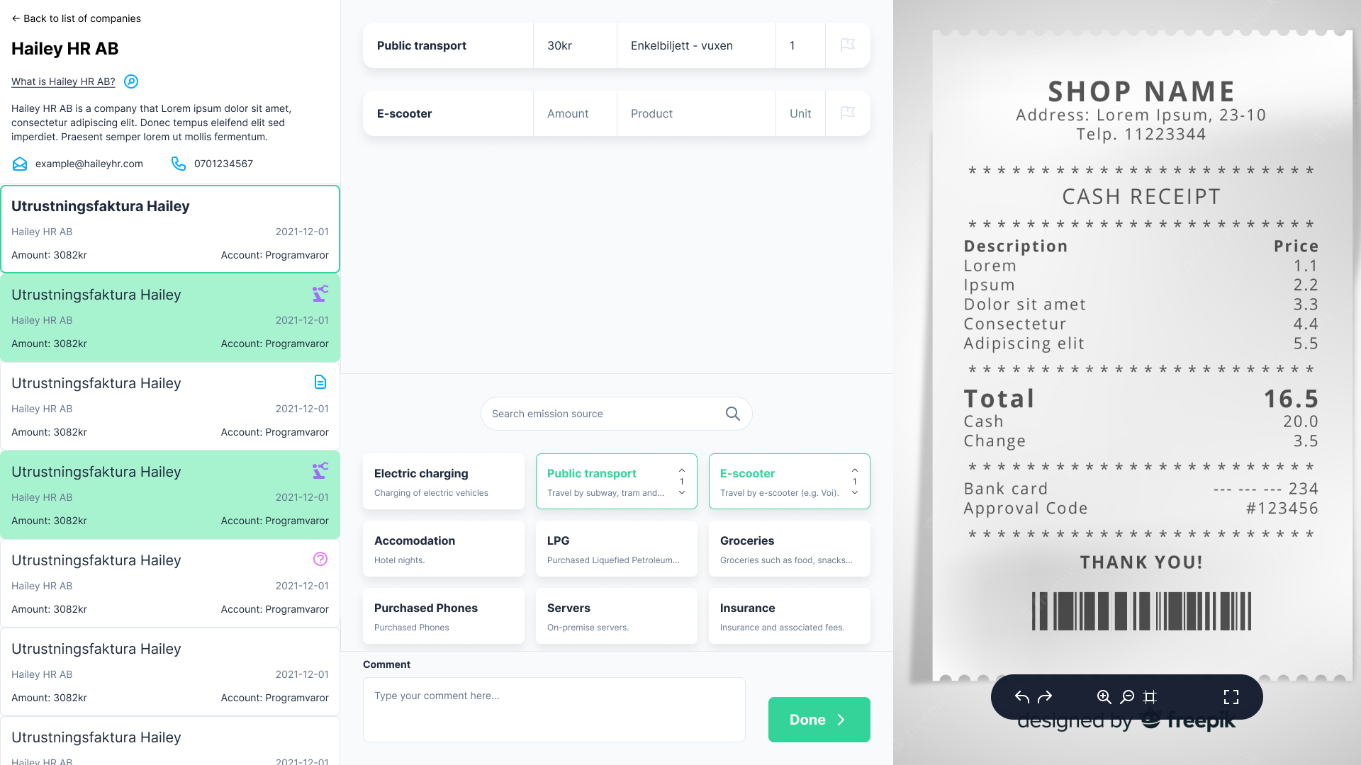
User testing interface variants
The next step was now creating variations of the different components that would be needed. Before I could begin with this though, I had to decide on fonts, colors, icons, etc. and essentially create parts of a design system. This would be needed going forward as well, so I began creating the beginnings of it and created the component variations necessary for the user prototypes that would be used in the user tests.

Iterating on features
I went through the design process again throughout the project to iterate to make incremental improvements to the interface. This included things like grouping emission sources into categories, letting users filter invoices, or enabling them to add emissioin sources to multiple invoices at the same time. These new features and smaller parts of the interface were all ideated upon, built as prototypes and evaluated with users. After a few iterations, we reached an interface that seemed to fulfil the project goals very well.
The result
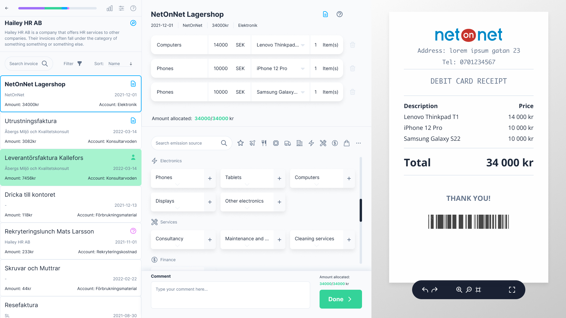
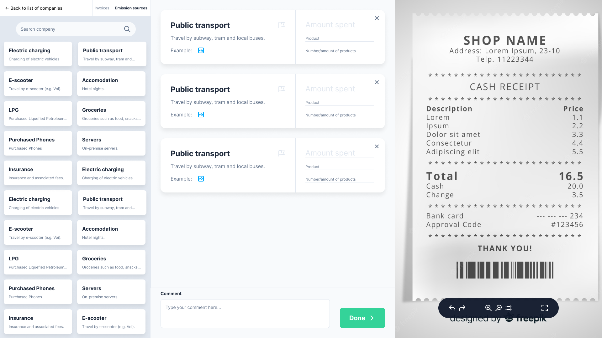
The picture above shows the final version of the main view. It sort of consists of three columns with the middle column being the main work area where you actually add emission sources to the invoice you are working with. To make more sense of this, here’s how one would usually work with BAT:

1. Look at the image to the right to check its expenditures

2. Add emission sources that feel appropriate

3. Press the Done button to go to the next invoice
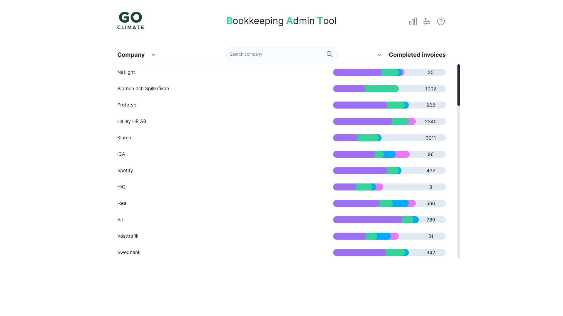
Aside from the main view, a few changes have also been made to the home view.
"A clear improvement to our workflow in every aspect. I would use this tomorrow if I could!" ~ User from GoClimate
At the end of the project one final testing and interview session was held with users. The results from this session show that the interface was successful in achieving the project goals. BAT was faster and more efficient than GoClimate’s old workflow, enabling them to go through a company’s invoices and produce a climate report in a shorter amount of time and with fewer steps. BAT was also more intuitive to use than the old workflow, with users feeling more confident in their work while going through invoices and being able to more easily tell what the most appropriate emission source was. The participants of the tests and interviews expressed excitement over the fact that BAT was as good as it was, and many asked for it to be deployed as soon as possible so that they could use it. The project was successful in improving its goals, and the daily life of the employees at GoClimate was made easier and less cumbersome.