Apex Todo List
A simple todo list app made with Flutter
Date:
September 2019 - January 2020
Keywords:
UI design, Android Development, Front-end
Tools:
Pen and paper, Figma, Android Studio
An android todo list app made with Flutter. The project was done by myself and involved both the design of the UI, developing the front-end, and integrating it with an SQLite database. The app can be found on Google Play Store at this link.
The challenge
The aim of this project was to develop my app-development skills. The goal of the project was to learn about cross-platform development with Flutter and Dart, by the process of creating some form of app.
A todo list involves a mix of aspects such as UI design, front-end development, state management, and database integration. Because of this, it seemed like a good fit for the goal of the project.
The process
Because I was creating the app for the sake of learning Flutter and Dart, I decided to keep the UI simple in terms of functionality. I wanted to include functions like adding labels to tasks, but I wasn’t sure I would be able to learn how to implement such functions within the timeframe I had set for the project, and thus these functions were omitted.
Requirements
This resulted in the following requirements - users should be able to:
- Add todos
- Delete todos
- Edit todos
- Group todos by category
- Add new categories
Finally, I set a timeframe for myself - I would finish the app by the end of the year. I began learning Flutter in September, which meant I had a few months to learn enough to be able to do something myself, design the app, and then develop it.



Creating iterations
The process began with sketching on a layout of the app on paper. To reiterate, I wanted to keep things simple so as to not design something I wouldn’t be able to create given my limited skills. The next step was creating prototypes in Figma, with lots of iterations. I began with a dark color scheme and made incremental changes to the UI, sometimes adding elements and sometimes removing something.
Applying UI design principles
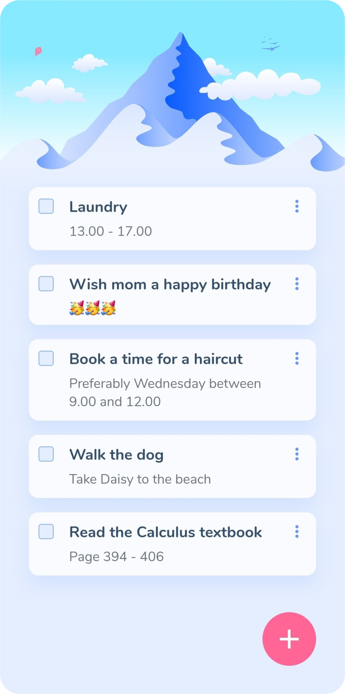
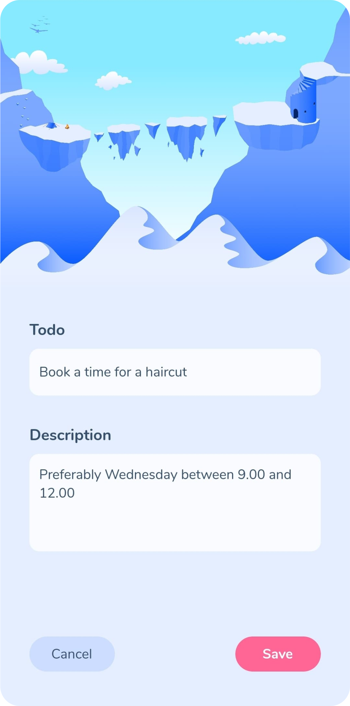
I made sure that the visual hierarchy was good so that the title of a todo was more visually readable than the description of the todo. In the end, I ended up scrapping the dark colors in exchange for a lighter color scheme, but I made sure that the contrast between the text, the cards, the buttons, and the background was still sufficient. The interactable elements on the home screen, like the todo items on the home screen or the textboxes on the edit todo screen, are placed nearer the bottom of the screen for easier reachability. I then filled out the available space at the top with vector illustrations that I made. I also sized the textboxes according to how much text one might usually write in them so that you can at a glance tell which one is for the title and which one is for the description.
Functionality first
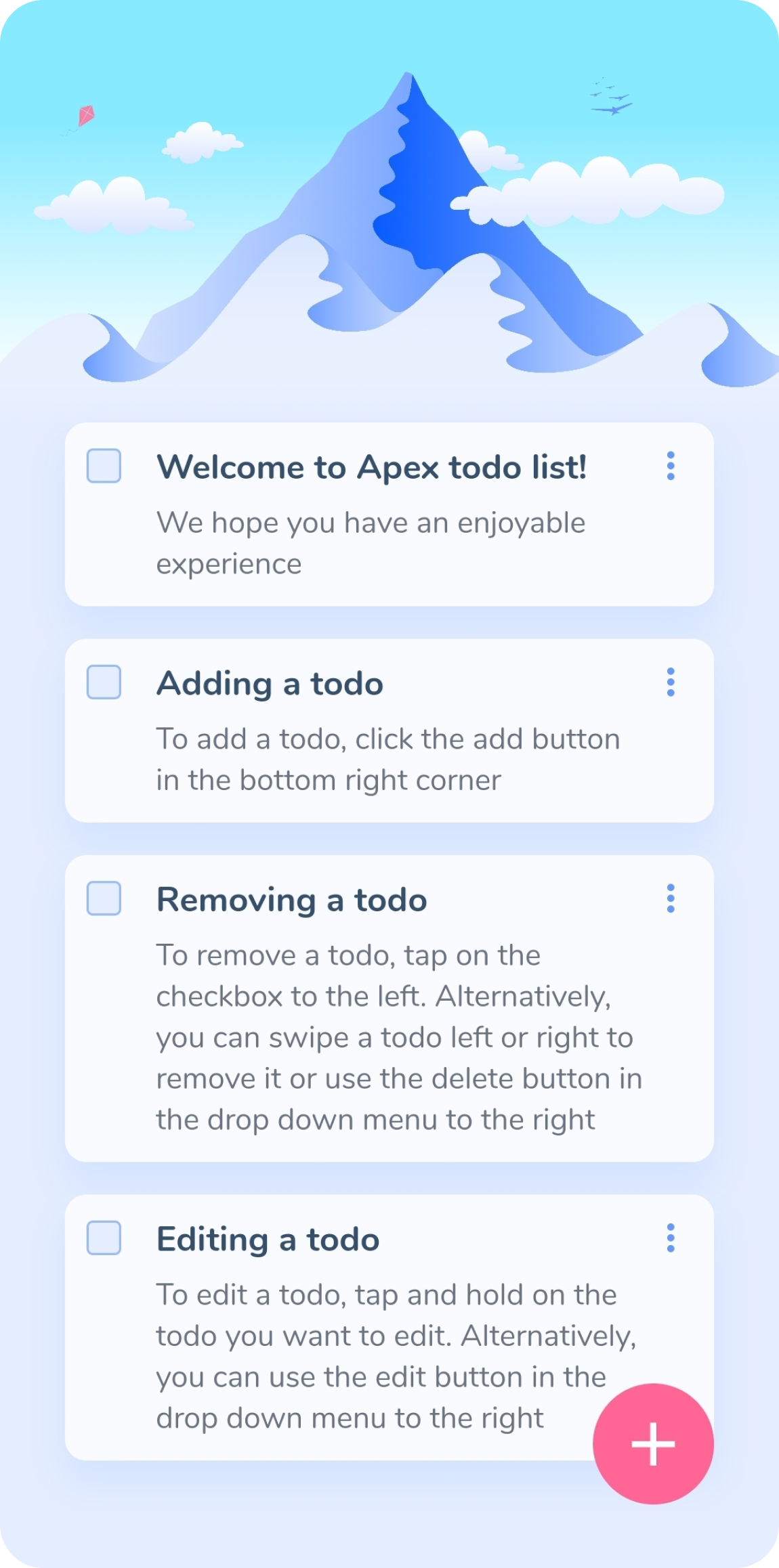
Once the UI was deemed sufficient, I began working on the actual code. Before anything else, I made sure the functionality of adding todos worked before working on the front-end. This was done using SQLite, which there is a Flutter package for. Next came creating the front-end and integrating the front-end with the database. Following that I added the functionality for removing and editing todos. Finally, I decided to add introductory todos for the first time users open up the app so that they can easily learn how it works.
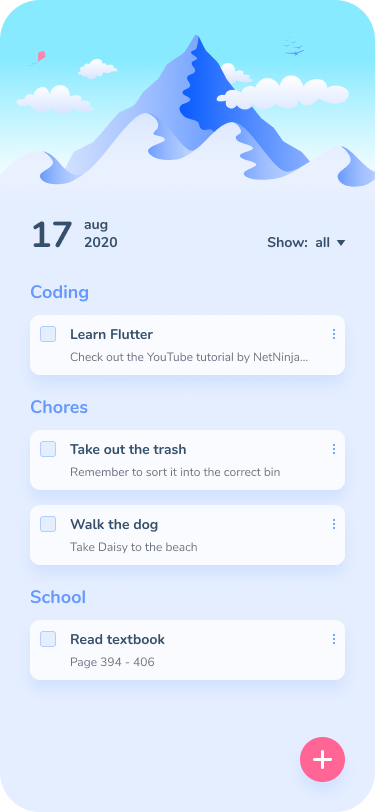
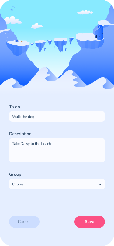
The result
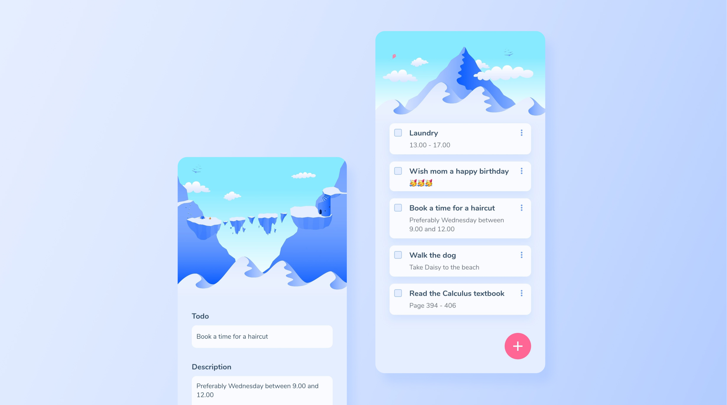
Because of the timeframe I had set for myself, I did not manage to implement the function to group todos by category. The finished app did however include everything else that I wanted to include. The app was released on Google Play Store in January 2021 and can be found here. Screenshots of the app can be viewed below.
